Monday 2 December 2013

Dynamic Visualisation

To demonstrate how the app will be interacted with by the user, I am going to create a dynamic visualisation. Because of the non-linear nature of my app I feel it would be best to use After Effects to achieve this - my storyboard files were all created in Photoshop and these two applications integrate very well with each other, i.e. you can import layered PS files into AE and animate individual layers.

Below is a video I came across that shows how to import PS files into AE.


To show a user interacting with my app I am going to film someone's hand against a green screen and then use After Effects to remove the background colour to make it appear as though the hand is actually touching the iPad.

Here are the gestures I filmed at home against a green backdrop.


Below is a tutorial I came across on YouTube which shows how to use 'key framing' in after effects to remove a solid colour and create transparency. This technique is used in filmmaking for visual effects elements and it is something I have had some experience with before. As this was a while ago, I found this video useful in reminding me the main points for the technique.


After trying to remove the green background from my recorded footage in AE, I discovered that the lighting was not ideal and so the background was difficult to remove effectively. I used the 'color range' keying effect, which allows you to remove a selection of colours but the result was still the same. I had a look for some royalty-free footage online and came across the video below (http://www.4shared.com/video/CD8lE2Bs/Manos.html). As the green colour is more consistent and vivid, it was much easier to key out the background.


The composition settings I used for my After Effects comp are: 1280 x 720px / 25fps.

Below is the first render of my project to test the keying effect against my design.

 
Once I was happy with this, I worked on animating the composition to fit with my visual storyboards. Here is the video that I presented during a group crit on Wednesday 27th November:


The feedback from this was useful in giving me an impression of which areas needed to be improved before the hand-in deadline. I was recommended to add a voice-over to explain the different actions taking place on-screen and also to use different cuts to make it clearer which assets are being interacted with by the user. I wrote a script (below) and borrowed a directional microphone and zoom recorder from my brother to record the voice-over. A friend who is undertaking a media production course at the Hastings campus of Brighton Uni agreed to read the script for me.


BirthYear
Voice-Over Script

Introduction

Introducing ‘BirthYear’ – an interactive iPad app that allows users to discover and share events from the year they were born.


App Launch

On opening, the main navigation menu appears and the content window displays information on how to use the app.

This stays in place until the user has chosen which year and categories of events they would like to view.


Selecting A Year

To select a year the user taps the ‘BirthYear’ logo in the navigation bar, which opens a drop-down menu containing a list of chronological years.

This list can be scrolled from left to right until the desired year is highlighted.

The selected year is displayed in the Timeline indicator and the user now has to choose which categories they would like to see on the Timeline.


Selecting Categories

The categories menu shows a list of different categories that affect the types of events displayed on the Timeline.

When a particular category icon is selected the relevant content is generated on the Timeline.

At any point, the user can change the Timeline content by selecting or de-selecting the category icons in the menu.


Timeline

The Timeline can be scrolled by tapping and dragging the screen to reveal more events in chronological order.

The month of each series of events is displayed above the Timeline.

Tapping on an event on the Timeline opens it up into a full-screen view.

To access the menu during full-screen mode, the user taps anywhere on the screen.

The audio for a video can be turned on or off within the settings tab.

To close an event in full-screen mode, the user pinches on the screen, or the video will automatically close and return to the Timeline once playback has finished.

Some assets appear differently in their full-screen modes. Where text is present, the user can read more content by tapping the ‘show more’ button. The text can then be scrolled up or down by tapping and dragging on the screen.

To return to the previous information, the user flicks up on the screen.

The share button allows the user to post their favourite events to social networking sites such as Facebook and Twitter.


Settings and Help

The settings menu is available throughout the whole app experience and users are able to create and edit a profile page, which is linked to their Personal Timeline.

The help screen contains the information that was displayed following the app’s initial launch. This can also be accessed at any time within the app.


Personal Timeline

‘BirthYear’ offers the user the opportunity to personalise and save the content they like onto their own Timeline. This is accessed by tapping the Personal Timeline icon.

The Personal Timeline displays events that the user has saved from the main ‘BirthYear’ Timeline.

The user can upload their own personal content, including videos and photos, which can then be published onto the main Timeline, or remain private on their own Personal Timeline.

The user can share their Personal Timeline with family and friends on social networking sites, allowing them to provide a personalised impression of their birth year.

To return to the main Timeline, the user taps the Timeline icon, which replaces the Personal Timeline icon when the Personal Timeline is active.


Closing Summary

Our lives are stories and most of us don’t know how or where ours began. ‘BirthYear’ gives you the unique opportunity to place context on your birth, alongside the important events, news and trends of the time.

This is your story. It’s time you knew how it started.

___________________________________________________________________________________

I found some appropriate music on Audio Network, a site that is used by production companies to source royalty-free sound effects and music. My brother recorded the track from the site for me so I didn't have to pay for it, but I would obviously pay the download fee if my video were to be broadcast.

The final render of my dynamic visualisation which includes a voice-over, a variety of shots and the music track can be found in my submission folder on the 'Hercules' server - for some reason it wouldn't allow me to upload this video to my blog.


Friday 15 November 2013

Storyboards

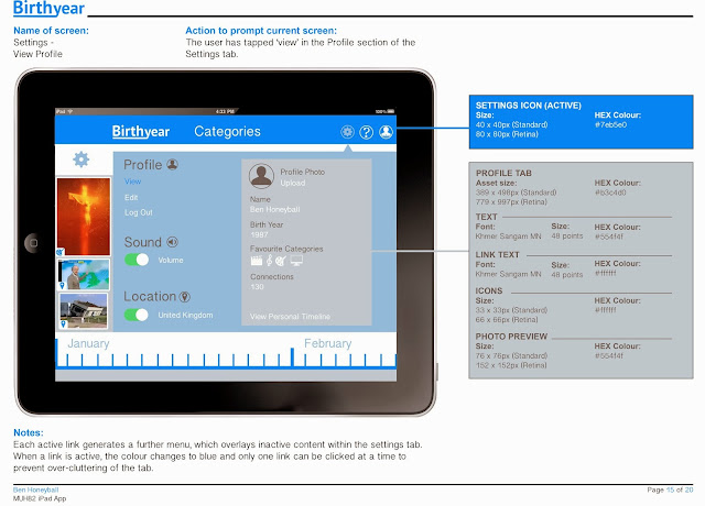
The storyboards are important to show the look/design of the app but also to explain technical details to a potential developer. In my storyboards I have shown all of the main navigation routes within the app and indicated the interactive elements. I felt it was important to include some of the design information, such as colour references and the size of assets so that it could also serve as a style guide for the app should I lose any of the design elements.


Some feedback from friends about the app design and storyboards:


Sunday 10 November 2013

App layout design


These are the dimensions I am going to design my screens to, which will ensure they could be used and implemented by a developer.

The layout for my designs are going to be based on the wireframes I created and the overall feel is going to be reminiscent of a social networking app that has been designed with the iOS7 guidelines in mind.

Below are the individual screen designs, which will be incorporated into my visual storyboards.


Here are some of the modifications I made during the design stage:
  • The BirthYear logo is now positioned in the top left of the navigation bar. This is what the user presses to open the drop-down list of chronological years - This serves as both a navigation tool and a brand reinforcement and maximises the space available. I felt that the logo would be too cramped below the timeline as in my original wireframe.
  • I decided that there needs to be some indication above the timeline panel of what year and categories have been selected. I came up with the idea of creating a 'timeline indicator, which makes it clear to the user what elements are currently active and affecting the content on the timeline.
  • The timeline zooms in when the user clicks on an asset to show the exact date of the event.
  • I took out the background colours for the category icons, as I felt they didn't fit with the overall design scheme.

Friday 8 November 2013

Technical Considerations - The Personal Timeline

It's important to make sure that any technical requirements proposed by my app would work in practice should I hand it over to a development company. Most of the interactive areas I have included in my wireframe are detailed on Apple's technical guides (covered earlier in my research).

The only aspect of my app concept that I am unsure of, from a technical perspective, is the use of a draggable 'widget'  to access the personal timeline (see relevant Wireframe below). This works for the chat bubbles on the Facebook app, but when a chat window is open that screen becomes active, and if you click outside this screen then the app returns to the previous information. In my initial concept I wanted the user to be able to drag the personal timeline widget across the screen and then to click and drag on the assets they want to save and drop them into the personal timeline window. I have looked on several different websites for advice on whether this would be possible but have not found anything that convinces me it could be achieved successfully. Therefore I am going to re-think the way the user accesses the personal timeline.


I don't want to direct the user away from the main timeline if I can help it, because this is the main focus/function of the app. One way of maintaining the responsive feel of the other screens would be to add a new button at the top of the navigation bar (next to the help and settings icons) which when clicked would change the content on the timeline to the assets that the user has saved to their personal timeline. This would preserve the timeline throughout the entire app experience and the personal timeline icon would serve as a switch between the main timeline events and the users' own content. When the user is on the personal timeline screen, the icon would change to a Timeline icon to indicate that when clicked it would take them back to the main timeline.

Wednesday 6 November 2013

UX and Usability Testing Workshops

On Monday 4th November we visited two development companies in Brighton to receive talks and workshops on usability testing and user experience.

CogApp
The first company we visited was CogApp, who "help organisations use digital media.
Our speciality is mission-critical projects and our mantra: long-term value for our clients." (Taken from the home page of CogApp.com). 

They have done a lot of interactive work for museums and have also adapted several books into iPad apps, which is of particular relevance to our current assignment. Chris How, who is an Information Architect at the company gave us a presentation on organising information within an interactive application. 


He defined information architecture as "organising content in a way that makes sense to the user." Information can be organised using the 'LATCH' system: Location (geographical or physical), Alphabetical (a good, logical way of organising huge quantities of information), Time (chronological or by date published), Category (separate areas of similar interest) and Hierarchy (order or number, most popular or most viewed). Of these principles, I realised that the 'Category' system applied most to my app concept and I had already decided to organise the content available to the user in this manner. Although the use of the timeline will also utilise the 'Time' method, as the assets will be displayed in chronological order from the selected year.

Chris got us to participate in a couple of exercises and then explained briefly about usibility testing. In this context it refers to providing a portion of the target audience with content from the app/website and observing how they naturally organise them. Card sorting is the main activity CogApp uses to achieve this and Chris recommended Donna Spencer (http://maadmob.com.au/about/bio-donna-spencer) who has written books on the technique of using card sorting to find the best information architecture solutions.


(Taken from the description of Donna Spencer's book 'Card Sorting: Designing Usable Categories)

This is an activity I would like to use in the user testing for my app if I have the time/resources. If not I will bear in mind for future user-targeted product designs.


ClearLeft
The second company we visited was ClearLeft (clearleft.com)

"We help organisations radically improve their websites and create exciting new digital products. We combine a unique lean approach with our knowledge of human behaviour and the principles of user-centred design." (Statement from their website).

This session was presented by Ben Sauer, who talked to us about usability and user experience and how to test for these on digital products. We were split into groups and asked to select a website and devise some instructions for a test subject to carry out. We used CogApp's bespoke software (Silverback) which allows the moderator to record and track the users actions on the website. This method seemed very effective in gaining an understanding of how a normal person uses a website, and would be useful in any future web-based projects I carry out on the course.


Tuesday 5 November 2013

Usability considerations

There are several considerations I need to make relating to how my app will be used by the target audience. The main functional elements need to be clear and easy to use, otherwise the user may become confused and ultimately be put off using the app after their initial download. 

Menus
The menus need to be clear and their function should be obvious to the user. In my app there are two main menus; the 'year selector' and 'category filters'. I need to think of a way to make it visually clear which year has been selected and also which categories are 'active' and affecting the type of content that is displayed on the timeline. On a website it is common to use a rollover effect to indicate to the user the interactive elements on a page. However, this is more difficult to achieve in an app due to the absence of a mouse/cursor. In my designs I am going to investigate a couple of options for the menus, and I will then send them to a few people within my target audience to 'test' (visually rather than physically). This will give a good insight into what my app users may expect from the navigation. 

The two options I have initially thought of involve a) creating a check-box for each category so that it is clear which subject has been selected (and is therefore affecting the assets displayed on the timeline) or b) to change the colour of the icons/text for each category depending on whether it is active or inactive. For example, if a category has been pressed by the user then the colour could change to white to show that it has been selected, whereas inactive categories could be a darker colour (possibly grey) to indicate that they have not been selected. I think that selecting a year would work best as a scroll through list of years, but the active/inactive colour scheme could be applied to this menu as well for consistency.

"Research has shown that the best target size for widgets is 1cm x 1cm for touch devices; however, we still see some apps that have tiny targets, far below that recommended limit." From Nielson Norman Group Report (2011)

The State of iPad Usability

Timeline
The content that is related to each year is ultimately the most important element in my app; this is the reason that people will use it - to find out the story from the year of their birth. Therefore it is important to ensure that the timeline (which houses the content) is easy to use and understand. In my mind it seems obvious that if assets are positioned above a timeline, then users would expect to be able to scroll along the timeline to see more assets. However, I am going to put this in my next testing questionnaire, to find out whether the target audience would actually expect to be able to navigate the timeline in this manner.


Adding content to Personal Timeline
Another important feature of the app is the ability for users to be able to 'favourite' individual assets from the main timeline and save them onto their personal timeline (which can then be shared with friends and family). This action needs to be as natural and uncomplicated as possible and should not detract or lead them away from the main timeline. I like the 'chat bubbles' that are used in the Facebook app (http://www.cultofmac.com/223708/facebook-6-0-now-in-app-store-with-chat-heads-stickers-redesigned-ipad-news-feed/) and think that the option of dragging an asset to your profile icon (located in the bottom right-hand corner) may seem like a logical action for users familiar with the Facebook App. Another option would be to create an icon that can be clicked on the asset which automatically adds it to the personal timeline. The issue with this could be that the user may not know whether the action has had the desired effect - some visual indication would need to be implemented if I went with this option to provide clear feedback to the user.

Wednesday 30 October 2013

Category icon designs

It's important that the icons for my subject categories are clear and fit within the visual style of the app. For the menu I am going to include text next to the icons, as icons can be confusing to some users. However for the assets in the timeline, the category icons will be layered over them without the corresponding names. I am hopeful that by seeing the names next to the icons in the menu, the user will be more familiar with them when they come across them on the timeline.

Below is a good example of some custom school subject category icons I found on Google images. I like the fact that the images overlap the boundary of the container - it gives it a more interesting/stylish feel. 


Here are the subject categories that I am going to include in the app, along with some icons I have found online that could be adapted to represent them:

World Events (big news stories)


Local events (specific to country you live in)


Sport


Music


Movies


Literature


Art


Fashion


Technology


Celebrity (news, births, deaths) 


My Designs
I am going to create vector icons to represent the different categories of assets that will be available in the app. I like the idea of positioning them on coloured backgrounds, which can then be used on the relevant assets on the timeline to create a visual indication of what category a particular asset belongs to. I have found a website that provides the HEX colour codes (which can be selected in Photoshop and Illustrator).


http://ios7colors.com/

These are the initial backgrounds/badges for the icons that I created in Photoshop, based on the colour schemes from the above website. I have shown how they might look on dark and light backgrounds to help identify whether the colours will work in the menu.


To provide an alternative option I have also created some gradient backgrounds, to see whether these work better with the icons.


Vector Icons 
These are the icons that I am aiming to use to represent the different categories on the timeline. I have traced over them in Illustrator and created both solid and outlined versions so that I can see which fit best within the overall design. I was prompted to create the outlined versions by reading Apple's iOS7 guidelines, which recommend creating both filled and outlined versions of the navigation icons.
Initially I feel like the solid options stand out more and would therefore be visually clearer for the users in the navigation. However, this may not be the case once I've mocked up the icons against the coloured background (which I'm going to do next).


 These two images show the outlined icons against both solid colour and gradient backgrounds. Below are the solid icons against the same colour schemes.


I am still drawn towards the solid icons as being more successful in clearly representing the different categories. I am concerned that the outlined vectors may appear difficult to distinguish when they are scaled down within the navigation menu (they will most likely be 1cm x 1cm - as recommended in the Nielson report).