Wednesday, 30 October 2013

Category icon designs

It's important that the icons for my subject categories are clear and fit within the visual style of the app. For the menu I am going to include text next to the icons, as icons can be confusing to some users. However for the assets in the timeline, the category icons will be layered over them without the corresponding names. I am hopeful that by seeing the names next to the icons in the menu, the user will be more familiar with them when they come across them on the timeline.

Below is a good example of some custom school subject category icons I found on Google images. I like the fact that the images overlap the boundary of the container - it gives it a more interesting/stylish feel. 


Here are the subject categories that I am going to include in the app, along with some icons I have found online that could be adapted to represent them:

World Events (big news stories)


Local events (specific to country you live in)


Sport


Music


Movies


Literature


Art


Fashion


Technology


Celebrity (news, births, deaths) 


My Designs
I am going to create vector icons to represent the different categories of assets that will be available in the app. I like the idea of positioning them on coloured backgrounds, which can then be used on the relevant assets on the timeline to create a visual indication of what category a particular asset belongs to. I have found a website that provides the HEX colour codes (which can be selected in Photoshop and Illustrator).


http://ios7colors.com/

These are the initial backgrounds/badges for the icons that I created in Photoshop, based on the colour schemes from the above website. I have shown how they might look on dark and light backgrounds to help identify whether the colours will work in the menu.


To provide an alternative option I have also created some gradient backgrounds, to see whether these work better with the icons.


Vector Icons 
These are the icons that I am aiming to use to represent the different categories on the timeline. I have traced over them in Illustrator and created both solid and outlined versions so that I can see which fit best within the overall design. I was prompted to create the outlined versions by reading Apple's iOS7 guidelines, which recommend creating both filled and outlined versions of the navigation icons.
Initially I feel like the solid options stand out more and would therefore be visually clearer for the users in the navigation. However, this may not be the case once I've mocked up the icons against the coloured background (which I'm going to do next).


 These two images show the outlined icons against both solid colour and gradient backgrounds. Below are the solid icons against the same colour schemes.


I am still drawn towards the solid icons as being more successful in clearly representing the different categories. I am concerned that the outlined vectors may appear difficult to distinguish when they are scaled down within the navigation menu (they will most likely be 1cm x 1cm - as recommended in the Nielson report).




Tuesday, 29 October 2013

Logo design

The logo for my app is important, as it will be the first image that a potential user sees on the App Store. The app icon is usually a simplified, pictorial depiction of a brand's logo (http://www.cio.com/article/503569/iPhone_App_Logos_10_of_the_Best_and_Worst). I am going to start by designing a logo and to create a brand for the 'BirthYear' app and then I will design an app icon based on these elements.

Below are some images of standard Apple apps (that come pre-loaded onto most mobile devices) showing the difference between the iOS6 and iOS7 versions. This will help to ensure that the 'look and feel' of my app icon (and logo) fits within the aesthetic conventions of the latest operating system.

I have experimented with some different fonts in Photoshop to develop the text-based element of my logo. Below are the options I came up with. As mentioned in my sketchbook, I feel that a Sans-Serif typeface will fit better with the style of my app, as it is more  fitting with both iOS7 standards and social networking conventions.


Out of these options I am particularly drawn to the last one (PT Sans). It is more solid than most of the other options and it seems like a font that could be used in a social networking app or website. I am now going to try out some alternative layouts using this font (again in Photoshop) to try to find a good text composition for the main logo.


I liked the idea of merging the two words so that it appears as though it is one word, however some of the options I tried out didn't look quite right. I found that by lowering the second word and reducing its size slightly created the distinction that it is a separate word. This will hopefully work well with the 'timeline' asset added to the tail of the 'y' (as shown in my initial sketchbook-based designs).


This Illustrator composition shows the development of the text elements into a full logo layout, matching some of the ideas in my sketchbook. I liked the bottom layout, as the timeline element looks better than in the other options - the upside-down one looks more like a ruler and the timeline in my app will look like the one above (with the time points facing upwards rather downwards).


Monday, 28 October 2013

Name Options

From looking at other apps I have realised that 'The Year I Was Born' is too long to use as a name for my app. Apps generally have shortened, more 'punchy' names - I think this is to make them more memorable, also integrable into modern vocabulary (Whatsapp is a good example of this - my friends often use it as a verb: "I'll Whatsapp you") and to bypass the display name space restriction on the device's home screen (http://www.iphonedevsdk.com/forum/iphone-sdk-development/6389-maximum-length-application-name.html). I like the idea of combining two relevant words that can be put together to create one word that gives a flavour of the app's function and nature. MySpace, Facebook, NetFlix, LinkedIn, YouTube and SnapChat are good examples of websites and apps that have adopted this principle.

Key words:

Birth
Born
Year
Beginning
You
Me
I
We
My
Chronicle
Story
Timeline


Key phrases:

The year I was born
My birth year
The start of my story
My first year
The chronicle of your birth year


Possible alternative names:

BirthYear
YourStory MyYear - Could abbreviate to 'Myr'

Myr is an existing word meaning 'millions of years'
From Wikipedia:
Myr is in common use where the term is often written, such as in the Earth sciences and cosmology. Myr is seen with mya, "million years ago". Together they make a reference system, one to a quantity, the other to a particular place in a year numbering system that is time before the present.


Panabee Name Generator (Birth Year)


I used the above name generator to try to find something unique, but the options that were generated from typing 'birth year' weren't all that inspiring. Out of the options I currently have I am going to go with 'BirthYear' - it fits with the two word amalgamation common with lots of apps and social networking services and it gives the correct connotations about the main function of the app.


Wednesday, 23 October 2013

Flow Diagrams, Wireframes & Design considerations

Flow Diagrams
The two flow diagrams in my sketchbook show the proposed navigation path of my app. However, after thinking carefully about the functionality and user experience, I decided that having to click to navigate to another screen could potentially detract from the main focus of the app; the content on the timeline. I have therefore decided to make the navigation more self-contained and intuitive so that in effect the app opens up and progresses to all its possible routes within the same screen. This is a feature used successfully by the 'Wonders of the Universe' app and is also recommended by Apple in their iOS guidelines (see below).
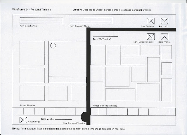
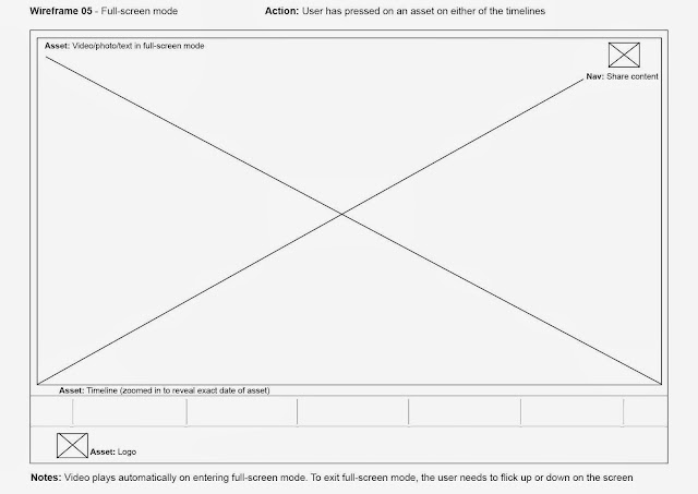
As a flow diagram generally indicates the navigation route and functionality of an app and as mine is going to have a self-contained navigation I think the best way to demonstrate the individual components/layout of each page would be to create wireframes showing how the screen changes with each user driven action.

Breakdown of 'screens'
These are the different navigable 'screens' that will be available in the app. As mentioned above these are not separate screens that the user is driven to, rather they reflect the changes in content displayed on the screen by different user-driven actions. These will be explained in more depth in my wireframes.


1. Launch image

  • Logo & strapline
  • Flavour of content

2. Main menu page


  • Top navigation - 'select a year'
  • Secondary navigation - category filters
  • Settings
  • Login
3. Main Timeline
  • Linear timeline (horizontal) with chronological placement of assets
  • Different types of assets - videos, images, text
  • 'Favourite' an asset
  • Access personal timeline (drag from right side)
  • Upload personal content
  • Option to share/integrate content with other social networking sites
4. Personal Timeline
  • Displays content that users have favourited
  • Shows connections with other friends
  • Option to share/integrate content with other social networking sites
  • Edit 'profile'
5. Full-screen mode
  • Videos/pictures/text appear in full-screen
  • To leave full screen mode users flick up or down
  • Timeline zooms in to reveal actual date
6. Share Content
  • Posts content to existing social networking profiles (e.g. Facebook / Twitter)
7. Upload Personal Assets
  • Option to upload photo/video
  • Add description/comments
  • Publish to personal or main timeline (or both)
  • Privacy settings
Wireframes


Design considerations
The graphic style of this app should be clean and simple, the main focus is on the content generated on the timeline and the overall design should not detract from this. I will experiment with different colour schemes to identify the hierarchy within the app - it could be beneficial from a usability perspective to colour code each category, so the user has a clear visual indication of which category each asset belongs to. Social networking apps/websites such as Facebook and Twitter have very simple design elements - they primarily use two colours and the focus is very much on the user-generated content displayed in the main feeds. The feedback from my initial questionnaire suggests that a proportion of my target audience would expect the app to look simple and reminiscent of social networking sites.


The assets I will need to design in order to assemble my storyboards and dynamic visualisation are as follows:


  • App icon (for App Store and home screen)
  • Logo (to be used at the bottom of the app throughout all navigation routes for brand reinforcement)
  • Category icons (for the category selection menu and to be included on all of the timeline assets for clear visual indication)
  • Timeline (this will need to be designed oversized so that it can be 'scrolled' during the dynamic visualisation)
  • Menu buttons (initial image and drop down)
  • Timeline background (this should be simple so as not to distract from the content)
Another consideration, although not specifically linked to the design of my app, is how far to go back with the available years that can be selected. It would be almost impossible to source pictures and videos from the earlier half of the 20th Century and I need to remember that the prime purpose of the app is for people to be able to access content from the year of their birth. I think it is unlikely that someone who was born in, say 1920, would possess the technical knowledge (or even own an iPad) to be able to use the app. I think that if I started the content from 1950, it would allow a better collection of assets to be included and also fits more within the demographic of my target audience.

    Tuesday, 22 October 2013

    Target Audience Questionnaire

    In order to gain feedback from the target audience on the concept for my app I thought it would be useful to conduct a survey, in the form of a questionnaire, to find out what people who will potentially be using the app think about the main idea. The questionnaire was sent out to a selection of my Facebook contacts. Although I understand that this route is open to biased feedback (seeing as most of the participants are my friends) I have found from past projects that the information generated from a survey like this can be useful. In an ideal world I would present the idea, along with some visual material (ideally a working prototype) to an independent focus group, however I don't have the time or resources to organise something like this at present.

    Below is a sample of the questionnaire that was sent out.


    Feedback from participants:


    Review of Questionnaire
    The feedback (although from a limited number of participants) is useful in gaining an impression of whether the app would be appealing to my target audience. Half of the participants  own an iPad, however all of them declared that they would be interested in using the app if it existed. This suggests that the concept in a real-world situation could be considered for development across all mobile platforms, rather than just being limited to the iPad. It could also work as a web site, allowing more users to experience the service offered. The participants also indicated that they would expect the design of the app to be clean and simple and reminiscent of social networking apps in terms of appearance and functionality. This matches my intentions for the design stage. The most requested categories (which were left open rather than providing specific options) match three of the categories I had intended to include in the app.


    Assets for Storyboard

    In the storyboard I am going to show the final design and navigation flow of the app. I will also include an example route through a particular year. As I was born in 1987 I am going to use events/stories/images from this year. I will also scan in some of my personal assets to be included in my own timeline.

    Personal Assets


    Category Content

    World Events
    http://en.wikipedia.org/wiki/1987


    Local Events (UK)
    General

    http://en.wikipedia.org/wiki/1987_in_the_United_Kingdom

    Hurricane (October)


    BBC News - Great Storm


    Michael Fish weather forecast


    Sport


    http://en.wikipedia.org/wiki/1987_in_sports


    Music
    General

    http://en.wikipedia.org/wiki/1987_in_music 


    Rock & Roll hall of fame

    http://rockhall.com/inductees/ceremonies/1987/


    Ella Fitzgerald inducted into the Rock & Roll Hall of Fame (January)
     
    Movies
    http://www.imdb.com/year/1987/


    Literature

    http://en.wikipedia.org/wiki/1987_in_literature


    Art
    http://en.wikipedia.org/wiki/1987_in_art


    Fashion
    http://www.elle.com/fashion/spotlight/elle-flashback-1987-410145#slide-1
    http://www.youtube.com/watch?v=WYyYeoqrmnc


    Technology
    General

    http://twentytwowords.com/2011/10/05/1987-video-from-apple-predicting-2011-computer-technology-is-not-far-off/
    http://en.wikipedia.org/wiki/1987_in_science


     Mobile Phones


    AT&T Commercial


    Celebrity
    Births

    http://www.imdb.com/search/name?birth_date=1987-01-01,1987-12-31


    Deaths
    http://www.imdb.com/search/name?death_date=1987