The two flow diagrams in my sketchbook show the proposed navigation path of my app. However, after thinking carefully about the functionality and user experience, I decided that having to click to navigate to another screen could potentially detract from the main focus of the app; the content on the timeline. I have therefore decided to make the navigation more self-contained and intuitive so that in effect the app opens up and progresses to all its possible routes within the same screen. This is a feature used successfully by the 'Wonders of the Universe' app and is also recommended by Apple in their iOS guidelines (see below).

Breakdown of 'screens'
These are the different navigable 'screens' that will be available in the app. As mentioned above these are not separate screens that the user is driven to, rather they reflect the changes in content displayed on the screen by different user-driven actions. These will be explained in more depth in my wireframes.
1. Launch image
- Logo & strapline
- Flavour of content
2. Main menu page
- Top navigation - 'select a year'
- Secondary navigation - category filters
- Settings
- Login
3. Main Timeline
- Linear timeline (horizontal) with chronological placement of assets
- Different types of assets - videos, images, text
- 'Favourite' an asset
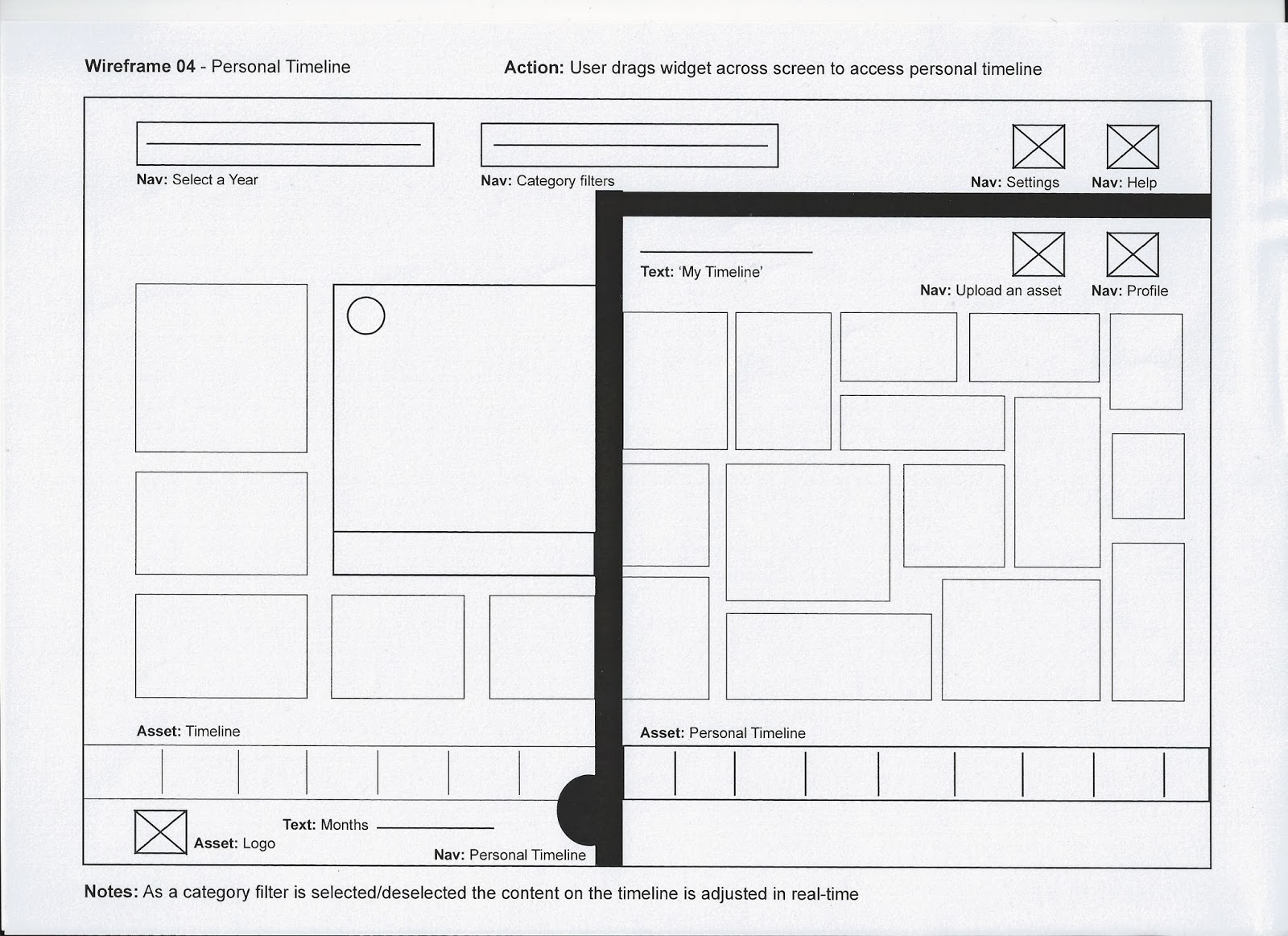
- Access personal timeline (drag from right side)
- Upload personal content
- Option to share/integrate content with other social networking sites
4. Personal Timeline
- Displays content that users have favourited
- Shows connections with other friends
- Option to share/integrate content with other social networking sites
- Edit 'profile'
5. Full-screen mode
- Videos/pictures/text appear in full-screen
- To leave full screen mode users flick up or down
- Timeline zooms in to reveal actual date
6. Share Content
- Posts content to existing social networking profiles (e.g. Facebook / Twitter)
7. Upload Personal Assets
- Option to upload photo/video
- Add description/comments
- Publish to personal or main timeline (or both)
- Privacy settings


Design considerations
The graphic style of this app should be clean and simple, the main focus is on the content generated on the timeline and the overall design should not detract from this. I will experiment with different colour schemes to identify the hierarchy within the app - it could be beneficial from a usability perspective to colour code each category, so the user has a clear visual indication of which category each asset belongs to. Social networking apps/websites such as Facebook and Twitter have very simple design elements - they primarily use two colours and the focus is very much on the user-generated content displayed in the main feeds. The feedback from my initial questionnaire suggests that a proportion of my target audience would expect the app to look simple and reminiscent of social networking sites.
The assets I will need to design in order to assemble my storyboards and dynamic visualisation are as follows:
- App icon (for App Store and home screen)
- Logo (to be used at the bottom of the app throughout all navigation routes for brand reinforcement)
- Category icons (for the category selection menu and to be included on all of the timeline assets for clear visual indication)
- Timeline (this will need to be designed oversized so that it can be 'scrolled' during the dynamic visualisation)
- Menu buttons (initial image and drop down)
- Timeline background (this should be simple so as not to distract from the content)
No comments:
Post a Comment